My last entry was Missing filter through all websites within UI/UX context: xFilter. I outlined there the reason why negative filter should be available from User Experience point of view. Using job portals I can narrow down results that include .net and C# technology stack but not to exclude Python language. Clothes website stores like Zara, Desigual give us shoes filter. We are able combine shoes filter with colours. It is not so handy when we want to exclude red shoes. What if someone has 3 pairs of red shoes and want something else this time? Accommodation portals f.e. Booking.com? Same issue. There is no something like xFilter, the excluding one at those store websites. The very why is at previous article, like I mentioned at the beginning above.
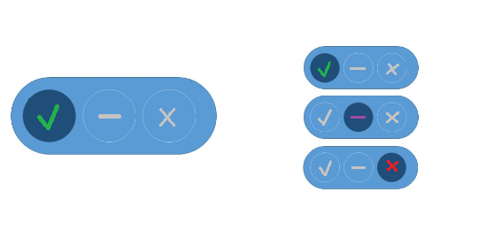
The best solution in my opinion is use of three state button. One button with default neutral state, middle state. Left switch with positive filter apply. Right side switch with negative filter option. Lets take a look below at the UI examples, one with text and second with check icons.
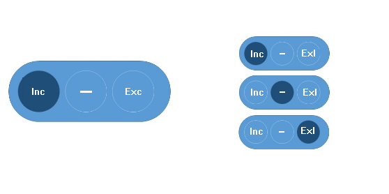 |  |
I was trying to achieve this with use of Figma design software. I found tutorial at YouTube Create a TOGGLE BUTTON (Option Switcher) With a HOVER Functionality (Figma Tutorial). Material is for designers more familiar with Figma itself. Finally I used just Windows Paint to achieve above result. I was using also Balsamiq just before Figma. It was much more easier for rookie first use but not for that what I had in mind. I was like solution pathfinder taking designer user experience. Taking that journey was an interesting experience. I started from simpler, more prototype case. Lets take a look below. Desigual clothes brand first.
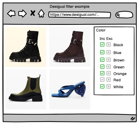 | 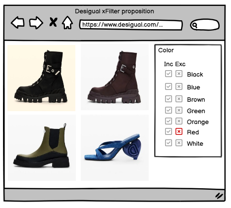 |
Example inspired by the Desigual using Balsamiq. To take not red shoes left case shows 6 steps long user experience journey. Right case is only a one click solution.
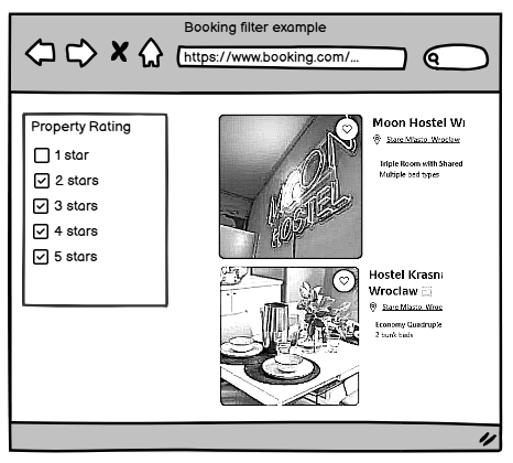
Shorter UX journey in my opinion is something like solving a Problem of user choice paralysis. Supermarket shopping takes us to much time? A 10-20 butter kind and brands paralyses us? We give up not knowing what to pickup? Finally leave not buying anything? Live hack to help us are these yellow or red labels with most customer choses or promotion labels. This saves us time and some dilemmas. Journey is shorter! Negative filters will help users in similar way. Do you agree or disagree. I’m I right more or less? I think more yes. Less drops off from funnel. Every step in process is separate funnel level. Shorter funnel means less drops of users from abounding our target. Target depends on Key Performance Indicator (KPI). For online store KPI is more obvious – end final goal is sale. Okey, secound example is accommodation portal, well known Booking.com.
 |  |
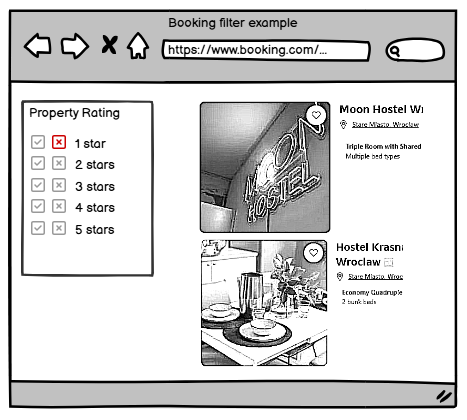 | 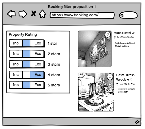 |
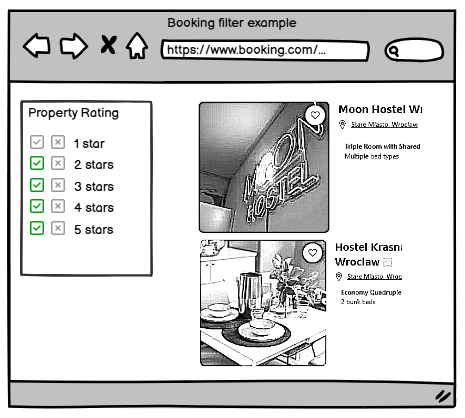
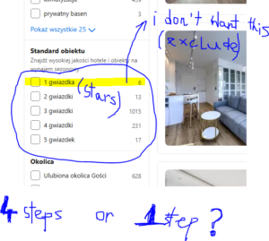
Example inspired by the Booking using Balsamiq. Upper left shows how it looks today. Upper right 4 step journey to take not one star accommodation. Next, bottom left is 1 step journey. We are within check boxes solutions at this moment. Easy to adopt as we use those checkboxes all around. Bottom right is move to final solution. Three state Button. Balsamiq was unable to support me with idea placed at the beginning of article. It is like middle solution. Using Figma I see that I’m able to achieve that, however I used simple Paint as it is only for this article purpose. After this second example mail article concept should be more clear as for first from Desigual was missing initial current view and middle solution.
I found out one example where negative filter is used. It not uses mine UI design concepts with three state button. It uses simple text box. Much more example of Cookidoo, the cooking platform for Thormomix devices, shows the importance for excluding some items within filters. Imagine that we want to bake a bread for ourselves. This Cookidoo platform provides us recipes and instructions how to prepare that food. We can filter all recipes with positive filter for bread. Lets assume that we are diabetic with metabolic problems against sugar tolerance. Someone maybe have problems with salt. Sometimes we watch a film and meet scenes after character eats something containing nuts ingredient and a dangerous allergic reaction. Fortunately for Cookidoo platform there is negative filter implemented. Design implementation with text box bellow.
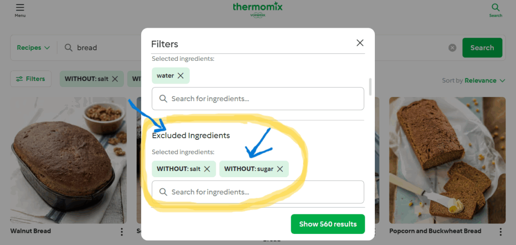
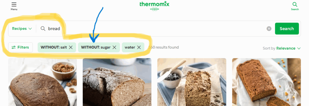
Examples from https://cookidoo.international
Summary. We were thinking about UI implementation for negative filter. I called it xFilter in previous article was Missing filter through all websites within UI/UX context: xFilter. This post entry is thinking after. How it could look like is not affecting starting concepts from previous idea, article. This is my point of view for now. Thank you.
Very well done—clear, engaging, and full
of helpful insights.